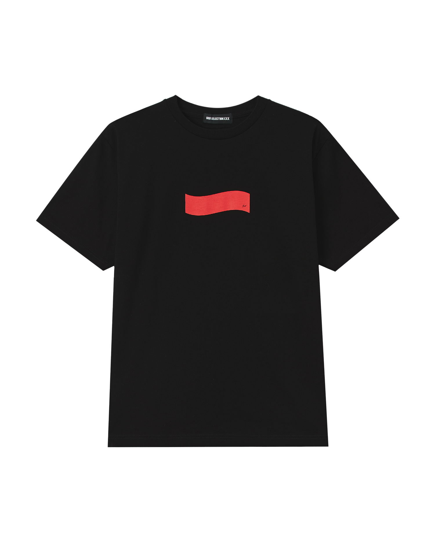
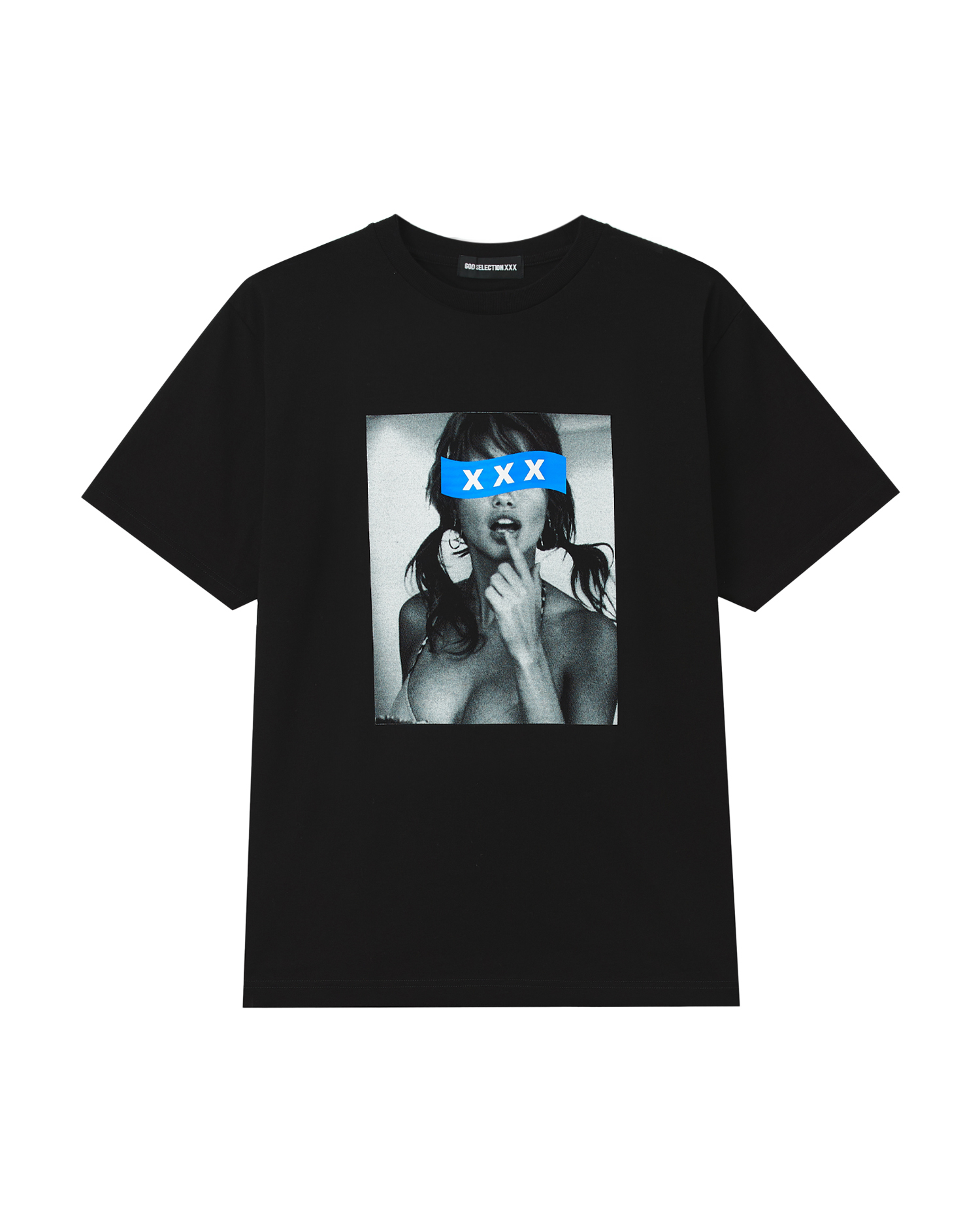
For a decade and counting, GOD SELECTION XXX has operated with a kind of deliberate restlessness—building a collaborative language that treats every object as a potential canvas for subcultural expression. Founded by Yasushi Yamaguchi and rooted in Shibuya's streetwear current, the label has never been content to remain within a single category. Its recent years read like a case study in strategic expansion: an 11th-anniversary capsule with fragment design, a Wallabee with atmos and Clarks, Converse Addict Chuck Taylors in both canvas hi and low, a BE@RBRICK for its tenth year, a NUMBER (N)INE anniversary salute, and a BAPE Ape Head tee that reimagined a sacred graphic.
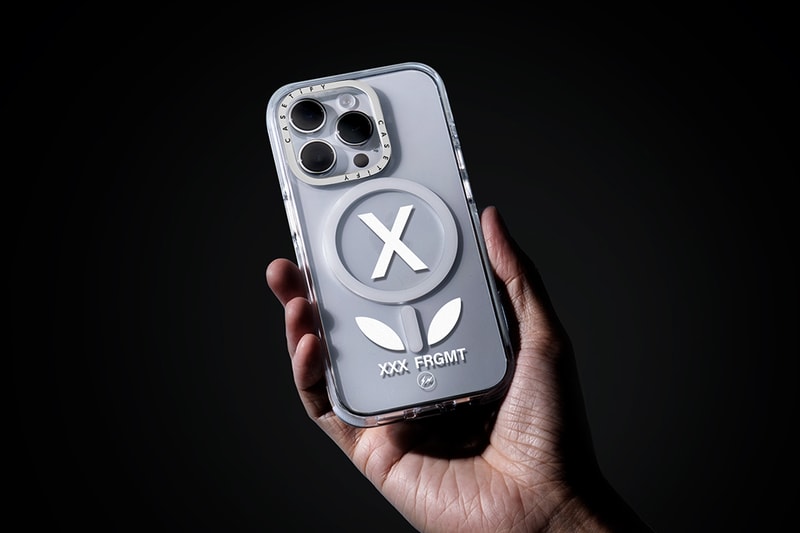
Each release reinforces a singular thesis—that GOD SELECTION XXX is less a clothing brand than a curatorial practice, one that places its name beside collaborators who share an instinct for precise, culturally literate design. The GOD SELECTION XXX x fragment design x CASETiFY Flower White Case extends that thesis into the most personal territory a brand can occupy: the object you touch more than any other.
Three Names, One Pocketable Form
What makes this case notable is not merely the three-way convergence of names, though that alone would warrant attention. It is the way the piece distills each collaborator's signature into a single, pocketable form. Hiroshi Fujiwara's fragment design contributes its unmistakable restraint—the double闪电 logo and a design philosophy that has always favored the understated over the loud. GOD SELECTION XXX brings its affinity for graphic subversion, the sense that a flower motif here is not decorative but loaded, echoing the label's recurring engagement with imagery that sits at the edge of menace and beauty.
And CASETiFY, the platform that has done more than any other to elevate the phone case from afterthought to collectible, provides the technical canvas: impact-resistant construction, a finish that holds its clarity, and the manufacturing precision that a three-party release demands. The Flower White colorway—also documented in a "Clear" variant—leans into a crisp, gallery-like palette that lets the graphic breathe, a choice consistent with fragment's long-standing preference for white, black, and navy as grounding tones.
The Phone Case as Cultural Surface
Culturally, the case arrives at a moment when the boundaries between streetwear and tech accessories have effectively dissolved. The phone is no longer a device you carry; it is the most visible surface you own, displayed on every table, held in every photograph, set down in every meeting. For a generation that treats footwear and outerwear as semiotic signals, the case is the logical next frontier—and the brands that understand this are moving quickly.
GOD SELECTION XXX's recent output, from the "1989" capsule with YU and GAN to the time-limited tee with I Don't Like Mondays' YU, reveals a label acutely attuned to memory, nostalgia, and the way objects carry personal narrative. A phone case, worn daily and scuffed over time, is perhaps the purest expression of that idea: a collaborative artifact that accrues meaning through use.
An Entry Point for Collectors and Newcomers Alike
This piece is for the collector who already owns the Converse Addicts and the fragment golf bag, but also for the newcomer who wants a single, legible entry point into a dense collaborative universe. It rewards the eye that recognizes the fragment闪电 and the GOD SELECTION XXX typographic signature, and it functions perfectly well for the person who simply appreciates a clean white case with a graphic that refuses to be boring.
In an era of relentless drops and diminishing attention, the Flower White Case matters because it is genuinely well-considered—a small object that carries the weight of three design lineages without collapsing under it.
Streetwear has spent years arguing that it belongs everywhere; with this release, GOD SELECTION XXX and fragment design make the case—literally—that it belongs in your hand. It is a fitting extension of a brand philosophy that has always treated collaboration not as a marketing exercise but as a curatorial act: placing precise, culturally literate design in the spaces of everyday life, down to the object you reach for without thinking.