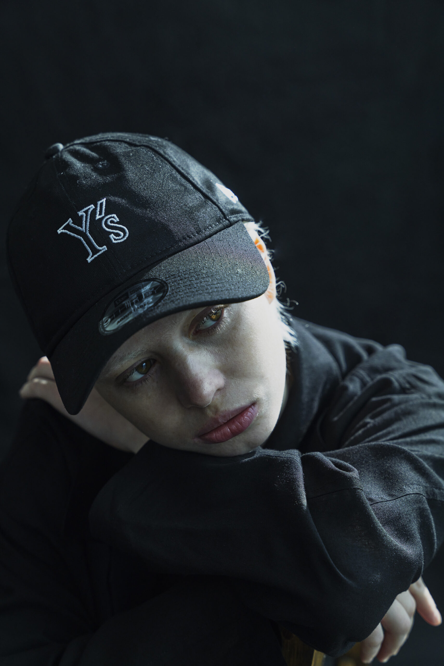
The Y’s x New Era FW26 Cap arrives at a moment when the boundary between luxury authorship and street-level utility has never been more porous — or more contested. Yohji Yamamoto’s Y’s label, long the cerebral younger sibling to his main line, has never been interested in shouting. Its collaboration with New Era, the American headwear institution whose 59FIFTY silhouette is arguably the most recognizable cap shape on earth, is therefore less a collision than a conversation conducted at low volume.
The result is a piece of headwear that reads, at first glance, as unremarkable — which is precisely the point.
The Architecture of Restraint
The construction follows New Era’s established architecture: a structured six-panel crown, a flat or gently curved brim depending on the variant, and the brand’s signature embroidered eyelets and top button. What Y’s contributes is a recalibration of proportion and surface. The cap sits slightly deeper than a standard 59FIFTY, a subtle adjustment that echoes the dropped, contemplative headspace of Yamamoto’s tailoring.
Fabrications lean toward matte, densely woven cotton twill and, in select colorways, a brushed wool blend that nods to the FW26 season’s cooler register. Color is deliberately restrained — black, charcoal, off-white, perhaps a faded olive — with branding kept to a minimum: a tonal Y’s mark where the New Era flag might ordinarily sit, or a small embroidered logo at the rear closure. The effect is one of erasure, of a garment that withholds its own provenance.
Double Exposure
This withholding is the cultural argument of the piece. New Era caps carry a specific semiotic weight: they are the uniform of dugouts, of corner crews, of a certain American vernacular that prizes visibility and affiliation. Yohji’s work has always operated in the opposite direction, favoring the draped, the obscured, the anti-logo.
Placing his label on a New Era cap does not domesticate either party. Instead, it produces a kind of double exposure — the wearer is simultaneously inside and outside the codes of streetwear, participating in a form while quietly declining its usual declarations. This is not the brash fusion of high fashion and sportswear that dominated the 2010s. It is something more mature, more ambivalent, and arguably more interesting: a cap that functions as a cap, not as a billboard.
Who It’s For
Not the collector chasing a grail, and not the purist who insists Yamamoto belongs only in a darkened atelier. The Y’s x New Era FW26 Cap is for the person who understands that everyday dress is where the most consequential aesthetic decisions are made — the commuter, the creative, the traveler who wants a piece that reads as anonymous in one room and quietly knowing in another.
It pairs with a Y’s wool coat as easily as with a plain sweatshirt, and it improves with wear, the brim softening, the crown molding to the head. That patina is part of the design philosophy, not an accident of use.
Why It Matters Now
The fashion conversation has grown weary of loud collaboration, of logos deployed as shorthand for relevance. Highsnobiety recently asked whether Yohji had gone the way of shapewear-driven minimalism — a provocation that misses the point of a career built on resisting exactly that kind of trend logic.
The Y’s x New Era cap answers the question by ignoring it. It is a small, unglamorous object that carries an enormous amount of thought, and it demonstrates that the most radical gesture available to a luxury house in 2026 may simply be restraint.
Wear it and say nothing. The cap says enough.